“I love color!” the artist David Goslin proclaims, and his paintings certainly bear that out. In the mid-1980’s, he visited New York’s Andre Emmerich Gallery because it was Morris Louis’ home gallery. Goslin asked to see one of the large poured paintings and was taken into a back room where an unframed, furled canvas was unrolled before his eyes. “It took my breath away!” he recalls. “and strengthened my resolve to paint something that beautiful.”
Despite a major exhibition at the National Academy of Sciences in 1982, painting was necessarily an intermittent interest during the years that David Goslin served as Executive Director of the National Research Council’s Commission on Behavioral and Social Sciences and then as President and CEO of the American Institutes for Research. He retired in 2001, and now, Goslin says, “more of my creative energies can be devoted to my painting.”
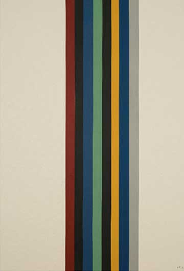
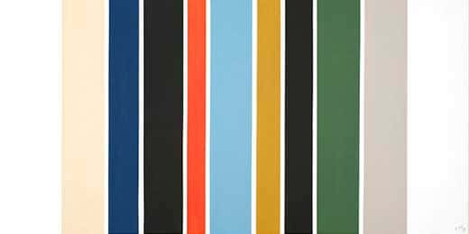
At first glance, Dave Goslin’s work brings that of the Washington color school master Gene Davis to mind. Certainly, the stripes hearken back to the latter’s work. However, Davis’ great canvases are notable for their visual pyrotechnics. His colored stripes never settle down no matter how long the viewer looks at them. The colors and their arrangement were chosen to create a visual instability which often infused the artist’s investigation of paint on a flat surface with an optical illusion of 3-dimensions.
Goslin’s work, although it does contain the occasional tension between colors, has a softer, more soothing effect on the viewer. Because of this, it is possible to trace his roots more clearly to Morris Louis than to Davis. Like Louis, Goslin has worked primarily on raw canvas, although some recent paintings use primed canvas. His acrylic paints are diluted with various mediums and laid down in multiple layers. So, the resulting impression we get from one of Goslin’s works is far softer than that of the Davis’ stripes. Also, and interestingly, Goslin makes pastel sketches for each of his paintings before beginning work on them. By using pastels as his sketching medium, Goslin makes his initial color decisions from a far softer palette, and such choices lead to the tranquil final paintings in a way that simply working with from-the-tube acrylic color could not.
Since 2008, Goslin has been exploring, step by step, the possibilities of bringing light into his canvases. Painting Number 111 stands at the beginning of his recent stylistic explorations. The brushy, horizontal bands of color tune gentle gradations from golden-orange, through brilliant blue, to black to brown. The painting seems to capture the light of a sunset over the ocean although it is purely abstract in nature. As these horizontal works continue in Numbers 121 and 125, Goslin’s mastery of infusing light onto his canvases becomes even more striking. A vision of monumental landscape or oceanscape emerges from the abstract bands made up of airily nuanced color. Along with these associations come a deep calming effect on the eye and the viewer.
A different take on the inclusion of light is seen in a second group of Goslin’s newer works. Paintings Number 124, now in the M.K. Ciurlionis National Art Museum’s Mykolas Zilinskas Art Gallery in Vilnius, Lithuania, and Numbers 126 and 127, are also composed of horizontal stripes. However, now they are “like color fields,” wide and quite muscular, reminders of the stripes of modern master, Sean Scully. Additionally, Goslin has begun to use silver paint which he describes as “an unstable color”. What the instability provides in these paintings is, once more, luminosity, and this time, it is truly reflective.
As Dave Goslin’s new work proceeds, other masters of abstraction, come to mind. “Rothko, of course,” states Goslin, “and I count Scully among the contemporary painters who are influential in my work.” While Scully’s stripes are more brooding and their relationships more complex, it is the painterly aspect of Goslin’s newer work, coupled with a relentless exploration of colored stripes that reminds us of Scully and his assertion that, “The stripe is a signifier of Modernism.” Take a good look at David Goslin, a painter just as devoted to this tradition. He is expanding the language of the stripe and Modernism with each new painting.
Florie Gilbard October 2009 David Goslin #122, 2009
David Goslin’s influences are immediately recognizable. Walking into the first room of his current show at Gallery A, the colors and compositions of his hard-edge stripe paintings reference Morris Lewis, Barnett Newman, and of course, the Washington Color School. There is a retro aesthetic throughout the show that may come, in part, from these influences. The browns and blues used in these paintings are particularly evocative of popular decorating palettes from earlier decades, which, coincidentally, seem to be coming back into fashion again.
Goslin’s most successful pieces in this exhibition show his subtle understanding of color. Often times, hard-edge stripes can create a color vibration that is hard to study for longer than a second without hurting one’s eyes. This is not the case in Goslin’s paintings. In Untitled-120, specifically, nine vertical bars of different widths make the viewer’s eye dance across the painting with the vibration of the colors, but in a very comfortable way. His muted tones serve as a complimentary foil to the brighter colors and as a visual resting place.
David Goslin #122, 2009
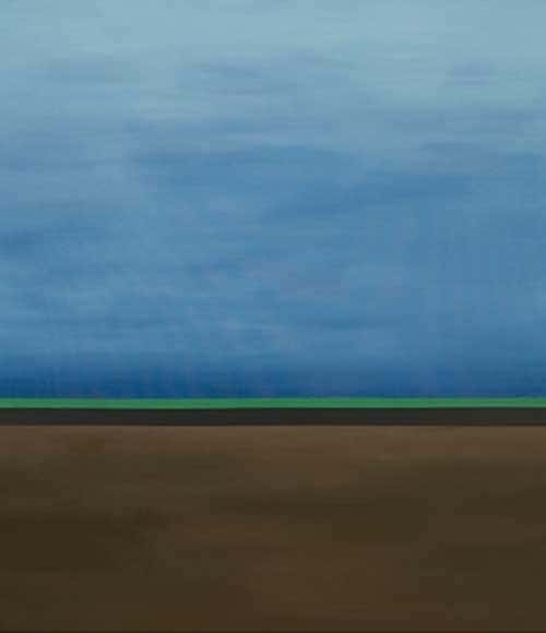
Also of interest are the paintings where he re-introduces color mixing on the canvas. There are several large pieces that have to be called landscapes. Two horizontal stripes of a single tone each separate a ground color and sky color that have subtle tonal shifts. Looking like a sea at sunset, a field after a rain, or a desert horizon, these landscapes celebrate color as the rest of the paintings in this show do, but bring in the extra element of narrating a place to the viewer.
Annie Turner The Washington Printmakers Gallery January 2010#150 (Spring 2), 2009
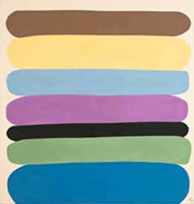
Known for his bright compositions, Goslin is unmistakably influenced by the Washington Color School. His vibrant pieces are distinguished for their technical qualities– every line is straight, and every color has been carefully chosen. However, more recent work has lent itself to a bit of experimentation. Stacks of horizontal ovals now recall the color field paintings of Mark Rothko. Goslin does this in his own familiar vocabulary, as his colors respect their boundaries and their edges do not blend with one another. As a result, we are able to look at each hue as infigcaptionidual and full of character; together on the canvas they create something more organic than works past.
Goslin does not abandon his signature style, however, as sharp edged lines can still be found in various works both horizontal and vertical. His work continues to pop, and his colors couldn’t be more eye-pleasing. David Goslin: New Color Paintings is a wonderful display by an artist who continues to expand and evolve his repertoire.